How to Create a Great Home Page for Your Service Business
So you are ready to update your website... Or create a new one...
Now the big question is: What do you actually say on your website?
There is a lot of noise on the internet about different ways to approach your website. I'm not saying that my approach is pure gold, but it has served me well.
So my goal with this article is to give you a simple framework that you can use to create the copy for your service business website.
Before you write your website
If there is one universal secret to writing great website copy, it is this:
Use your customer's language.
The biggest mistake most people make when creating a website is they come up with all of these ways to describe their services that mean a lot to them as the provider, but the prospects don't understand it.
I talk about this extensively in a past post on buyer awareness and it's worth reviewing as you enter into this website process.
Instead of coming up with ideas from scratch, you want to start taking notes on your sales calls.
How do prospects talk on your calls?
What phrases do they use?
How do they describe their problems?
How do they describe their desired solutions?
This is where great copy comes from.
Not from your brain.
But instead, from your prospective customer's mouth.
Create a document to capture trends and statements
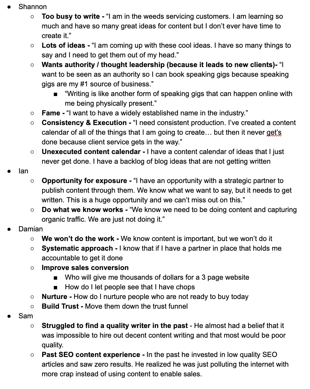
To do this, I recommend creating a document or somewhere to capture these trends and statements while you are on the phone with prospects. Below, you will see a screenshot of statements I have grabbed from my recent Content Allies sales calls.
How to write and organize your website
Now that you have captured the trends and words from your ideal prospects' mouths, it's time to organize all of those statements and lessons into a cohesive website.
To do this, I recommend following this simple framework from Copyhackers. This article is seriously my bible of writing web pages, and throughout the rest of this post, I am going to dive into some of the core concepts and share how I applied that to Lead Cookie.
The messaging hierarchy:
Source: Copyhackers
This diagram above shows the entire flow of content and messaging as it should flow through your web page. It is a simple framework of questions for your copy to answer.
If you follow this framework, you will cohesively work through all of the key mental triggers that someone needs to see for them to feel comfortable reaching out and inquiring about your services.
Top of the website: Matching
The first lines of your website are arguably the most important. They are essential to match your website with the right prospect and let them know they have landed in the right place.
The first section of your website should do the following:
Signal to your ideal prospect that, "You are in the right place. Keep reading!"
Signal to non-ideal prospects that, "This is not for you"
Hook them in with messaging that intrigues them to learn more.
Here is how that looks for Lead Cookie.
We actually lead with our Guarantee because that hooks most people in very quickly. Then, we follow that up with messaging to match our ideal prospects and give context about how we help them.
Meet your customers where they are at: The Bridge
The next section of the website is "The Bridge." This is where you meet your customers where they are at.
You hit on their pain points and use their language to repeat back their problem to them.
For example, on the Lead Cookie website, I hit on a handful of common pain points and statements from customers including:
They believe that "more leads" is the solution to all of their problems.
They have been relying on referrals, word-of-mouth, and inbound. As a result, they don't feel in control.
They know they need to be doing outbound, but they don't have the time, or struggle to stay consistent.
They desire someone who could just keep their prospecting consistent.
Once I hit on those pain points, I then shift to position Lead Cookie as the solution.
Hence why I call this section "The Bridge." I start with their pain point, and end by positioning the service as the solution.
Social proof = Good
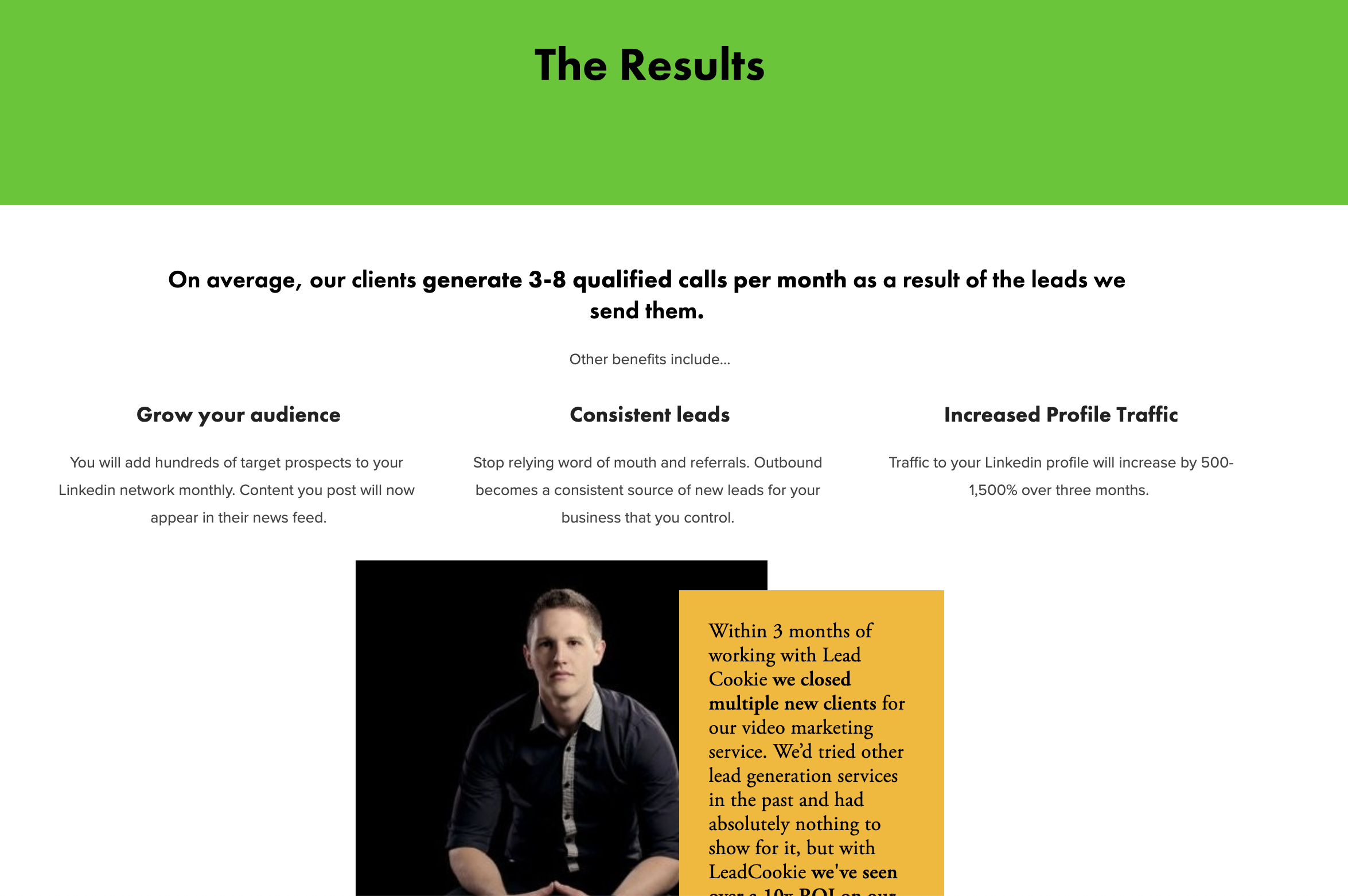
Social proof is one of the most powerful things you can add to a website. For the Lead Cookie site, you will see a TON of social proof throughout the website in different capacities.
We do this by listing out the companies our outreach has generated meetings with and through lots of testimonials.
While some people seem to believe there is some rule of thumb that says 3 testimonials max, I disagree and find that a wall of testimonials and listing out some of the results we have generated significantly increases our sales-conversion rates.
In terms of structure, I like to pepper in social proof throughout the entire site as it fits the design. The more, the better, in my opinion.
Visit the Lead Cookie website and you will see that this is only a small sliver of the social proof we include on our website.
How it works
The next section that I include explains how it all works. For many people, this is what they focus their entire website around. Even I've made the mistake of making the website too "how-focused" many times in the past.
But, in reality, you only need a small section on how your service works at a high level.
If you can, simplify this down into a 3-4 step process to make it look super simple and straightforward.
The "Irresistible Offer"
In addition to the steps on how the service works, this is a great chance to feature your "add-ons."
Russel Brunson of ClickFunnels has a phenomenal concept that he calls "The irresistible offer."
The concept is simple. Brainstorm all of the things that you could include with your offer that may be seen as a value-add to your customer.
In many cases, these may be things you are already doing but have not showcased. Or, they could be things that you could easily add to your service that include little to no extra work.
For example, at Lead Cookie, we have a handful of add-ons that set us apart from the competition and are valuable to our customers.
And the funny thing is, we did most of these before we added them to our website... It was simply the action of adding them to our website that started helping our sales conversion.
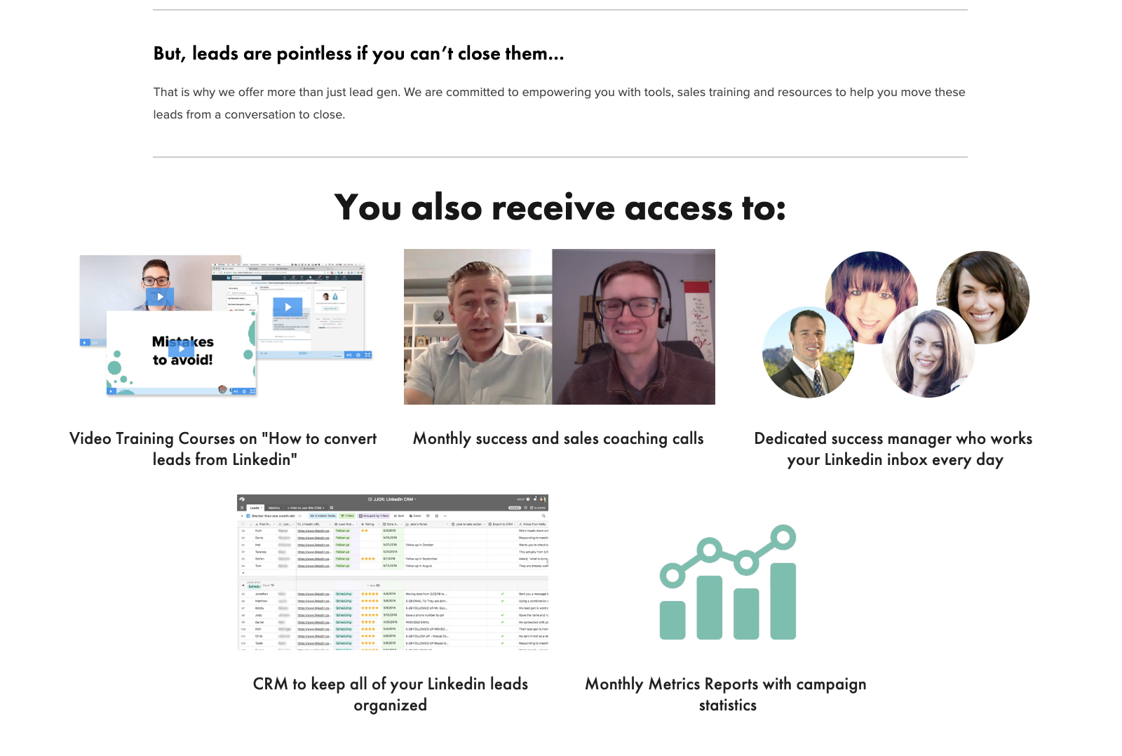
Here is what we added to the website:
Video training course on how to convert leads from LinkedIn - This is free training we give all of our customers on how to convert the leads we provided them. We made this video once and now it is a value-add to all of our customers now and in the future.
Monthly success and sales coaching calls - We were already doing monthly calls with our customers anyway, so this was simply another thing we could add to the site.
Dedicated customer success manager - Again, this is something we already did as part of our service, but by positioning it like this, it sets us apart from the competition who often just run black hat software.
CRM to keep all LinkedIn leads organized - We already had created a CRM to help our clients stay organized. So it made sense to add it as an additional feature they got with their purchase.
Monthly metrics reports - Once again, we were already doing this. It was just a matter of adding it to the website.
This "add-on" section was something that I didn't incorporate on the website until about 18 months into running Lead Cookie. But what surprised me is how often these points started coming up during sales calls.
Clearly, these were memorable and people were paying attention!
Why should I care?
This next section is simple. It hits on the benefits and "why" the prospect should care. I will admit, this is probably the one area of the Lead Cookie site that could use improvement.
But it gets the job done.
Why is it safe?
Now before you reach the end of your page and ask the prospect to contact you, you want to make it safe for them to do so.
This may sound ridiculous, but here is the truth...
People don't trust you.
They have no reason to trust you.
They are guarding their time, their inbox, and their attention.
And so you need to make it as safe as possible to have them contact you.
We do that with a 30-day money back guarantee at Lead Cookie.
In this section, we explain our money back guarantee and also use this as a chance to flip the tables around and say, "We only take customers who we are confident we can help. This is how we offer a guarantee."
Someday, I will write a full article on the money back guarantee, but all I can say is that it's 100% worth doing.
The Application
Notice the language in this section. I did not put "Contact Us." Instead, I phrased the section of the site around the wording, "Apply to see if you are a right fit."
First off, this is true. We turn away 80% of the leads we get because we don't think we can help them or generate a positive ROI.
Second, this flips the table. Now we have prospects proving to us why they are a good fit for our service.
This doesn't work for mass marketed SaaS companies... BUT, for most service providers, it is an approach worth taking. The truth is, you won't take any customer that walks in the door, so don't set yourself up to look like you will.
A note on tools
Now, I know some of you will ask, "What AI website builder tool do you use to build your websites with?"
Ultimately, the tool doesn't matter. But if you care to know, I use Squarespace, and freaking love how easy it is. I can build a website or a new landing page in a matter of hours, not weeks. And I can do almost everything 100% on my own without a coder.
A lot of people have some stigma against Squarespace and don't believe it's professional. I would beg to differ as I am running two very legitimate companies off of 100% Squarespace sites.
And that's how you create a website
Just follow this simple framework and model after what has already worked. Feel free to deviate at times, but just don't go too deep into the "how" on your website.
Keep the "how" at a high level.
And remember, the goal of a website for a service provider is not to make the sale.
The goal of a website is to get someone to contact you.
If you want to see another example, check out my Content Allies site. It follows a very similar framework, although I will admit, at the time of publishing this article, the site still needs some work.
As I have more sales conversations for Content Allies, I understand my prospects more and more. And this is helping me build and refine my copy over time...
Which brings me to one final point-
Just ship it.
Just launch it.
You will always update and change your website along the way.
Just get something out there and iterate on it.


